First Impressions takes a fresh look at printing, asking what goes before, or lies behind, a finished print. The exhibition uncovers the hidden stories and histories of the relief printing process and asks us to think again about how we value a work of art or craft.
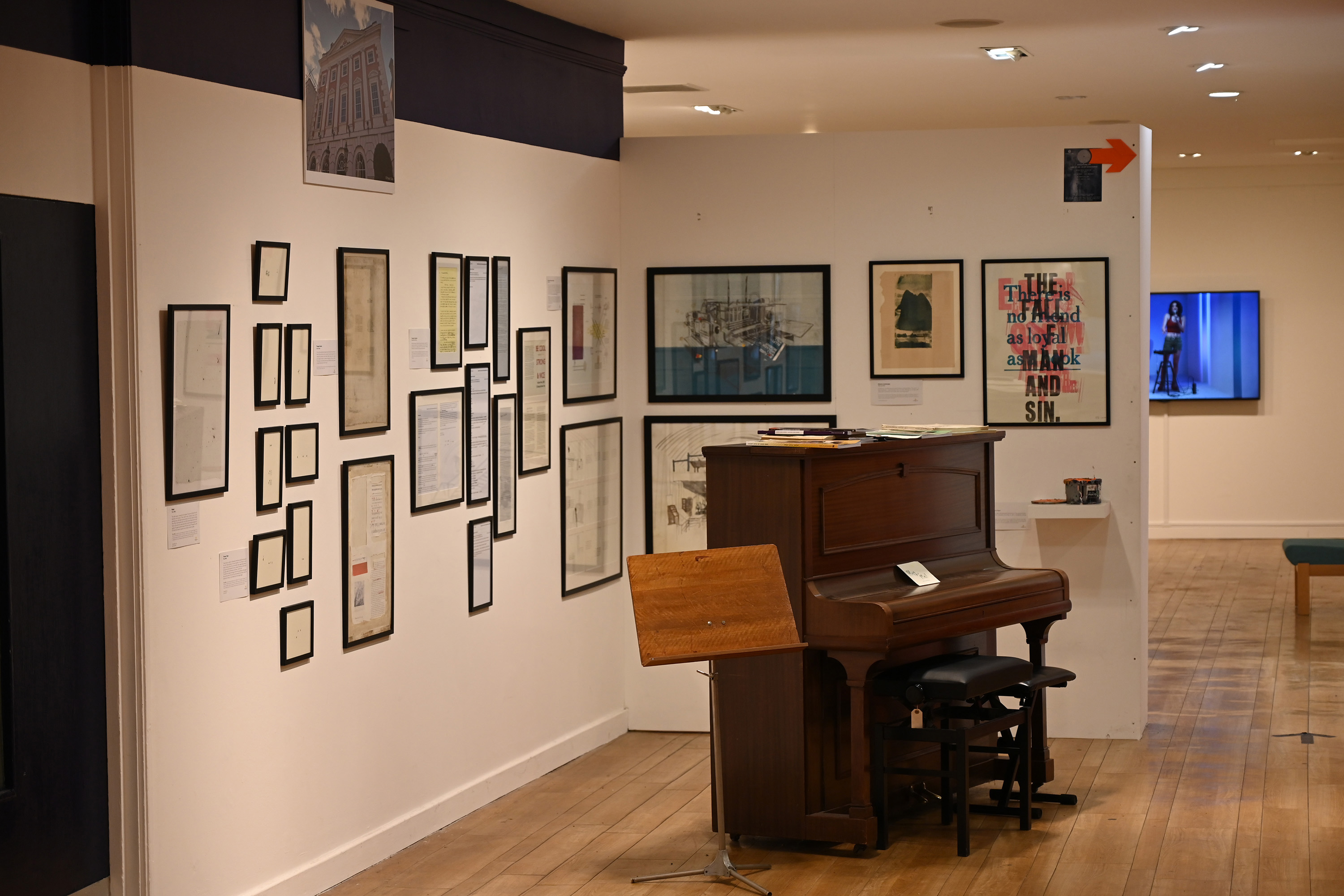
Some elements in the exhibition embrace the raw materials of print. Nick Loaring’s ‘wild ink cans’ – tins filled with the residue of numerous printing sessions – sit next to Theo Miller’s blank paper, filled with the ashes of his previous work. Enjoy the intriguing effects Theo has produced from pieces of type retrieved from the Thames foreshore, and explore the blocks that Nick has created to make his striking and innovative prints: laser-cut blocks, engraved blocks, hand-cut blocks, fret-sawed blocks, routed out blocks, and more. Some were for music projects, some are big, some small, some are still covered in ink, filthy, or half finished.
Once you have your materials, you need a printing press, at least for most forms of relief or intaglio printing. These come in many shapes and sizes. You can view a beautiful example of a Columbian Press, made in 1845, in the StreetLife Hub, alongside the exhibition. We are touched to be able to exhibit a used tympan cover and frisket from Derek Nuttall, who ran Spectrum Press. These are essential components of a platen press, and bear the traces of Derek’s last printing project, undertaken before he retired from printing. These used objects create a visually striking record of a life dedicated to print.
Graham Moss, of Incline Press, takes us through the whole of the printing process in miniature, sharing the work that went towards a single prospectus. From a manuscript to a typed draft, to a set of email exchanges with an expert copy-editor, and on to a revised draft, galley proof, and finished prospectus, Graham’s selection takes us through the alterations, emendations and collaborations that shape a printing project. The prospectus advertises Graham’s current work-in-progress, Memento Mori: Memento Vivere, a book in memory and celebration of his wife, Kathy.
Two of the prints on display layer up the printing process, putting together all the parts that would normally be printed separately to build an image or text. Letterpress printing is full of mistakes, so printers take multiple proofs to check spellings, make sure the words are in the right order, and assess the inking and impression. A print made collaboratively by Bethany Boyd-Lee, Ben Goodman and Molly Jones is composed of proofs of several different posters, which, together, create a compelling and unsettling effect. Most proofs get binned, but Ben and his collaborators felt this one was too good to discard!
David Armes, who will have a residency with StreetLife in mid-June, will often hold a few sheets of paper back when printing a book and deliberately overprint every page onto a single sheet, sometimes reversing the page in the process. Included in First Impressions is a beautiful example where this happenstance technique has created its aesthetic reward.
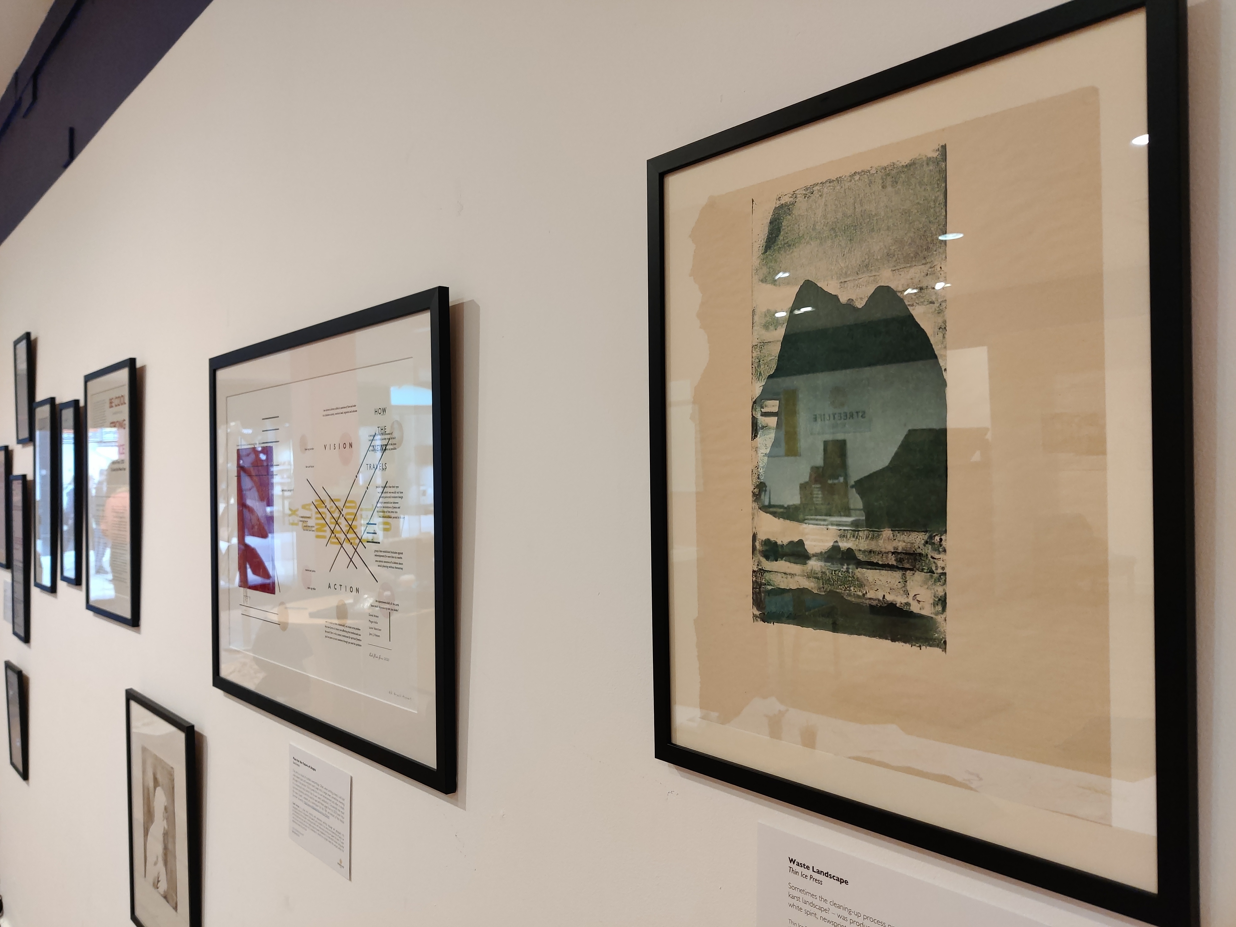
Happy accidents are a recurring theme of First Impressions. Ben Goodman, renowned for his intricate wood engravings, has shared a print taken from the twelfth layer of his latest reduction engraving (‘John’, 2022). Ben took a print from the block while it still had some solvent on the surface. The result was a surprisingly beautiful mix of engraved lines and painterly washes – one to be saved from the scrapheap. The University of York’s Thin Ice Press also feature in the exhibition, with a karst landscape that emerged during the cleaning up process. Like several of the other prints on display, this accidental artwork felt too beautiful to throw away.
If interesting waste sheets happen as a by-product of interesting projects, printer & typefounder Nick Gill binds them into a ‘Scrap Book’: a one-off partner volume to document the process and provide context for the original work. Our exhibition features three examples: Tympan Ghosts is made with top sheets from FAG and Heidelberg presses at Hand & Eye letterpress; Caryl brings together waste sheets from printing a festschrift for playwright Caryl Churchill, commissioned by the Royal Court Theatre; and Crescendo is a sequence of make-ready sheets from a discarded idea for Nick’s Plague Song graphic score.
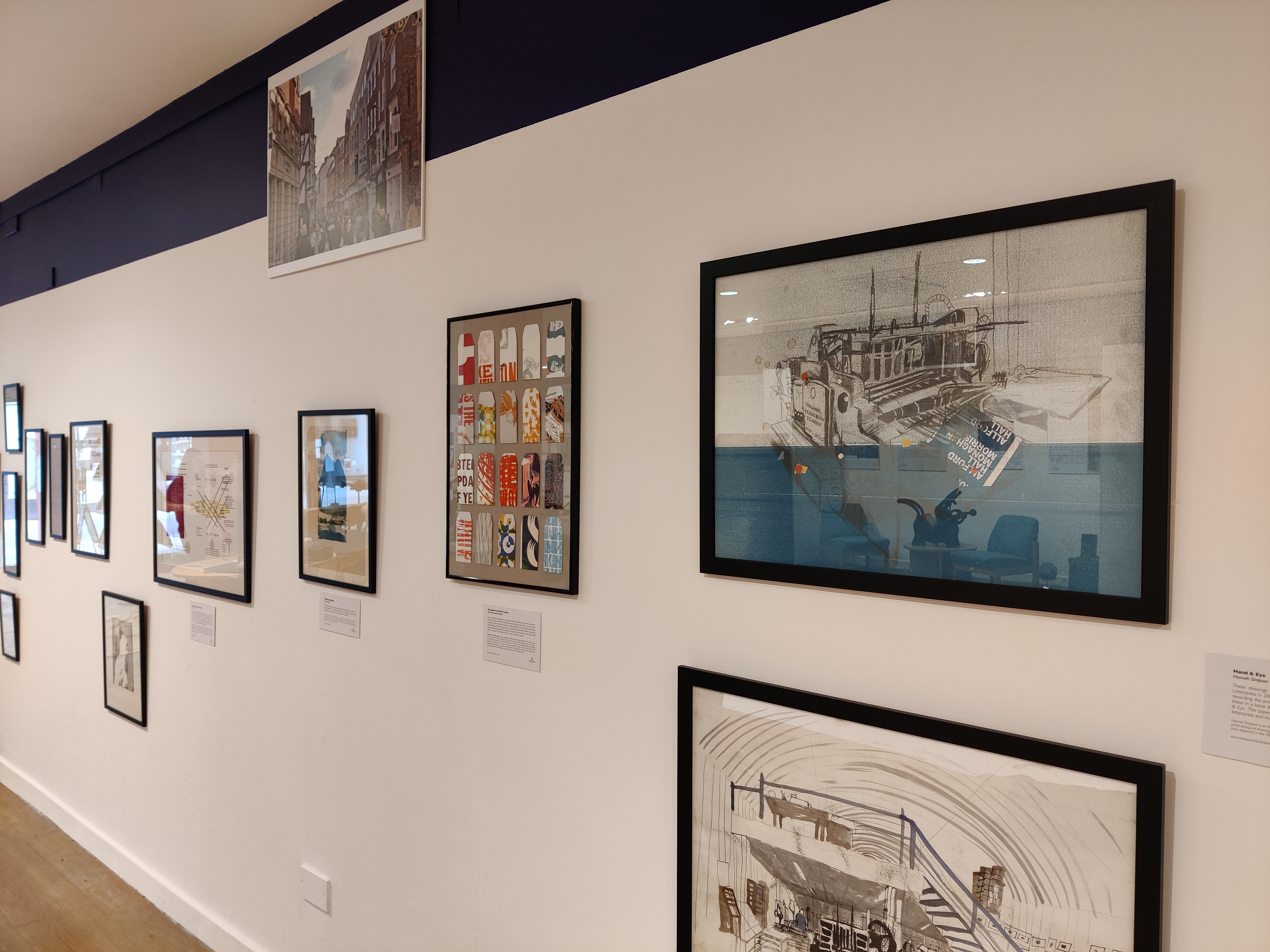
Other artists have deliberately made use of waste products: things that would normally head to the bin or, at best, the recycling pile. Hannah Simpson’s large drawings were produced in 2012 for a self-published book, Hand & Eye. Over a week, Hannah produced a series of drawings recording the processes of casting, typesetting and printing. The paper for the drawings is salvaged from around Hand & Eye letterpress and one drawing includes waste from the press.
Ellen Bills and Nick Hand keep the bright sheets you run on a press to get the colours correct and the print in the right position. They put those sheets through their Heidelberg Windmill press with a coin envelope cutter fitted. The envelopes represent the little envelopes that were common in the early 1950s and 60s, and Nick and Ellen like to think that they are made to carry some small piece of treasure. The designs by their nature are totally random.
In a similar vein, Janice Simpson has been exploring artists’ books as a way to display small prints and re-use rejected prints. Explosion books have been a way of giving new life to old prints whilst also creating an object that is both tactile and fun. The books in our exhibition feature printed images front and reverse, with covers created either from monoprints or prepared papers. The printing methods seen in the fragments include collagraph, etched lino, drypoint etching and monoprint.
A waste-bound book from the Vintage Paper Company is a hymn to waste, repurposing, paper and craft, bringing the materials of print together with its cast-offs. The book contains vintage watercolour paper, handmade in the 1950s by WS Hodgkinson, one of the great British papermakers of the 20th century. The cover is a two-colour, repeat pattern lino print on antique waste paper, with the print still visible. The spine is made from repurposed antique vellum documents, and the end papers are hand printed.
Twenty-Five Poems encapsulates many of the themes of First Impressions. A collaborative outcome of the Printed Poetry Project, featuring poet and artist SJ Fowler, printer and publisher Pat Randle and artist-printer and researcher Angie Butler. The edition of 70 copies was hand-set and printed over two days in May 2021. The content reflects an active collaboration: the time and process of writing poems, what happens to the text, printing letterpress. The group shifted their aesthetic approach and incorporated concepts as we found words, materials and objects and used blocks, proof prints and ephemera as parts of the finished work.
Join us to explore this exquisite exhibition, diving into the joys, frustrations and accidents of printing, and the effects they create.